If you haven't seen, a few weeks back I released my latest CS:GO project: Oyster, a wingman map set in a London tube station that I created as my submission for the Source Engine Discord's 2020 Wingman mapping contest. Now that the deadline has come and gone, and before the judges release their all-important feedback, it seems like a great time to look back at the development and reflect on some of the descisions, as well as giving my own self-critiques now that the dust has settled a bit.
The Concept
Wingman is a small-scale game mode. Each map has a single objective, rounds are often faster, and matches much quicker. Because of this, there's a bit more room to experiment. Aside from Rialto, the other official maps for the mode are cordoned-off versions of full-sized 5v5 maps, and this itself opens up the mode to different approaches because, unlike with competitive maps, there's no Valve-endorsed benchmark to base a design around. How exciting!
Looking at the other community maps, however, it's clear it's a real mixed bag. Some seem to have been designed as these huge, sprawling maps that feel empty with only four players in the whole match - too complex. Others seem to have been designed as a straight-up aim map that had a bombsite added - too simple. Again, not really much help.
With all this in mind, It seemed clear that I should aim for a simple layout to compliment the fast rounds and also some sort of a unique take on theme - more on that later.
Having now looked at and played a bunch of maps, I sketched a number of different layouts and bombsite placements, with the aim of bringing out the best of the mode: the speed and the need for flexibility in the players and in the playspace. From there, I came up with the key elements of the design that later became Oyster.
- A longer-range high-risk, high-reward route direct to the objective.
- A mutually contested middle, where the victor of a fight gains access to a valuable alternative route.
- A large, focal bombsite with limited viewable angles.
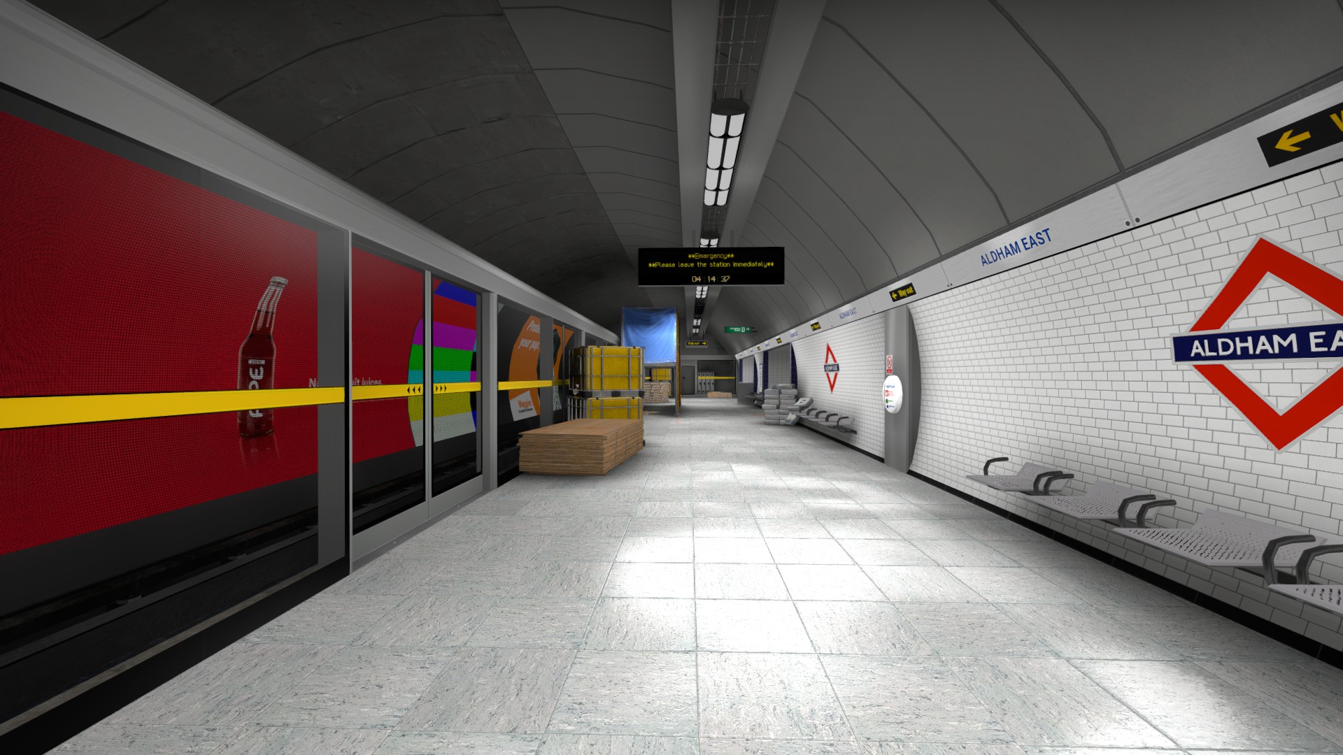
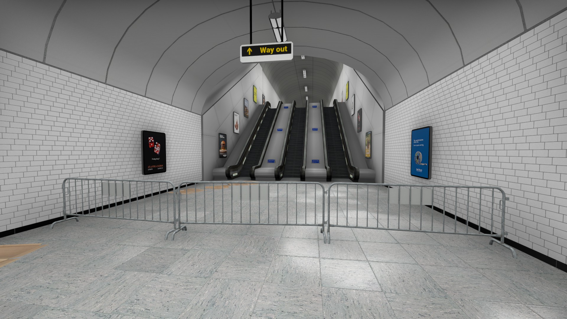
Oh hey, this looks like an underground station.
Revision, Revision, Revision
"You might have an idea, but you can never really tell how a map plays from an overview." - Plato
The earliest versions of the map that I made in Hammer saw this concept implemented as-is. Although terrorists would have the additional route of a second path that runs parallel to long, and just cuts out the far-end and rejoins long before the bombsite. At the time, this seemed necessary, but why the hell would anyone go up long? Good question. I don't know.
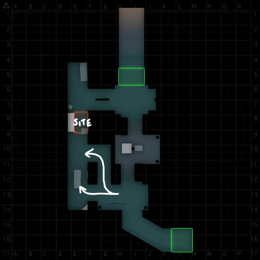 The earliest versions of the map had two parallel routes down the platform for Ts.
So scratch that. Rather than simply giving T's access to a flank, what if mid also provided access to a drop connecting straight to the bombsite? This played much better, although still seemed inorganic in practice. Once you dropped, you were stuck. Yeah you might plant, but then your only option is to fight and from an even more disadvantaged position. Stupid idea. Moving on.
 This second route was made into a drop from middle and although this solved some problems, it caused many more.
It would make more sense to streamline this area, making the objective apart of the connector, and providing means to get both down and back up this route rather than a drop. In fact, a spiral staircase would fit in nicely here, provide some different angles and it would work with this theming concept I've got going. This changed the flow of the map, made rotations fun and the additional options for both teams made matches more about game sense rather than dueling. Fantastic.
The terrorist approach to middle also changed a fair bit during this time. The hoarding was important to ensure that T-players weren't stuck in their spawn and added another angle to watch from middle so that they could cross more safely. The added right-angle corner on the stairs also worked far better, players were no longer simply playing king of the hill over a mound, they were fighting in a new, open area and with additional angles which made gunfights more fun.
Those ceilings got a whole lot higher. I kept making the ceilings higher. Higher! Higher and higher - to accommodate more utility usage. This is an absolute pain with an enclosed map, especially one set 15 storeys underground, but I've made an effort to add utility options and complexity in every area on the map. I've also added visual details in many places, such as the placement of ceiling fixtures along the platform, to help players in lining up nades and to add some additional geometry for some cool tricks.
On the other side of the platform, there was always a bunch of cover. Players could dip in between these spots, but it sort of made everything a bit claustrophobic, and quite frankly a bit of a pain in the ass. If you take out a player on long, you want to get down that length as soon as possible to get a better spot before the other defending player is able to rotate to defend. This immediately reminded me of everyone's favorite map Dust 2 but not long - B tunnels. Of course the platform here is a fair bit wider than that, but its sort of the same concept, and there's no cover there at all. This made the area flow much better. Players are encouraged to play more aggressively, which was always the winning strategy along the platform. It required tweaking the timings to make this really feel right, so the spawns were moved a bit. Surprisingly, this actually swung this route in the favour of the Ts in our playtests - would you believe!
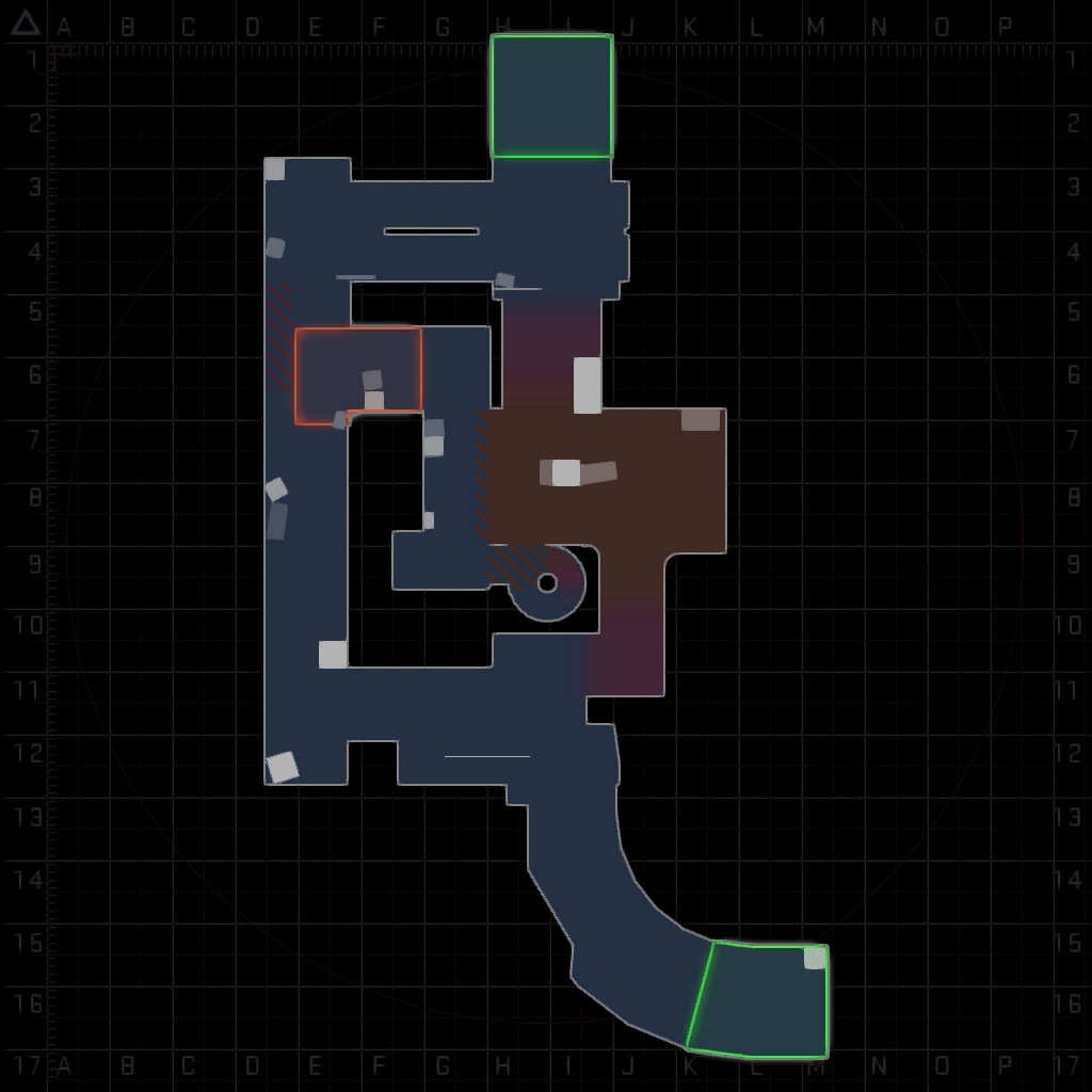 The layout at time of release, with the new approach towards middle and with the revised connector area.
We played many many hours on this map, and I'm confident that this layout is a fun and engaging wingman layout. Although I'm excited to see how it can be changed to further improve the map after seeing even more matches on the map!
I'm also glad I spent so many hours fixing stupid and weird angle peeks and gaps in between props. I'm sure that I didn't accidentally add props to my selection and move them when making other adjustments! I hope this doesn't create any visual exploits in the final contest version! (This is foreshadowing)
Make it Tubular
Nothing says unique like being set in a metro station, huh. Well.. erm.. hold on. Looking at the other metro maps on the workshop, they're all kind of.. grim, right? They all have a similar approach to visual design, working off the idea of replicating an older and more grimy station, or with some wacky custom assets. I felt confident that there was room to improve here, or at least offer a different and more unique take on the theme.
The visual design of Oyster is based on a number of real stations on the network, with the aim of being as photo-realistic as possible. Certain areas were inspired by certain locations more than others.
Platform
The platform is inspired by Jubilee Line stations and in particular Waterloo.
T and Middle
The T-side approach and middle areas is a mix of several areas in Bond Street station.
CT Spawn
The CT-spawn escalators were modeled after those in Angel Station, although these are found in a bunch of places on the network, and all look pretty similar.
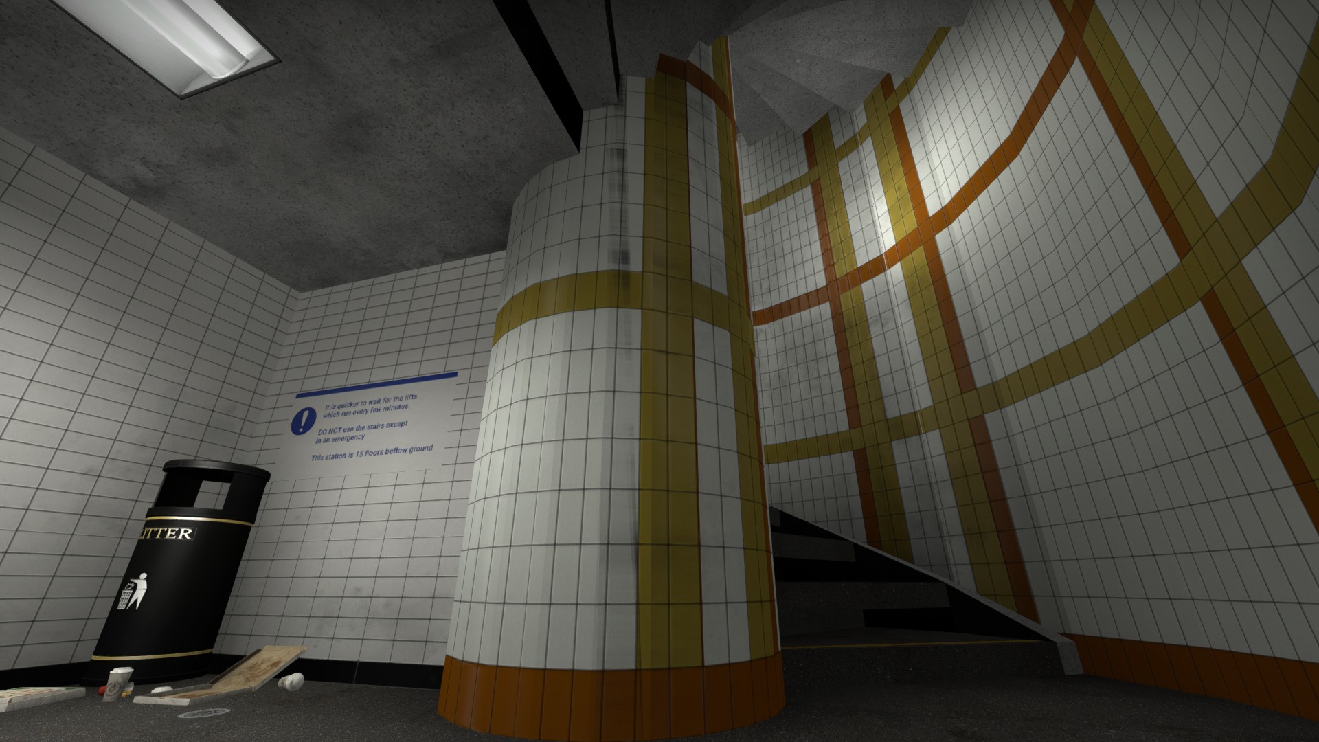
Emergency Stairs
The tile motif and general design of the emergency stairs are based on Covent Garden. I don't think they were worried about stair clipping back in 1900s.
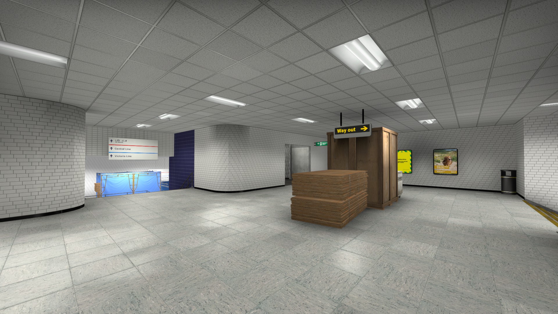
Many of the textures are either taken from freely licensed photos or hand-drawn from reference. An under-construction station, especially with TfL's new modern aesthetic would be super clean, bright, and minimal. The stations don't have a large amount of visible grime, or wiring or ventilation features. And, although there are places on the map where I did use these elements to add visual detail, some players, mostly other mappers, have said they would like to see more. However, for the most part I stand by my original decisions here.
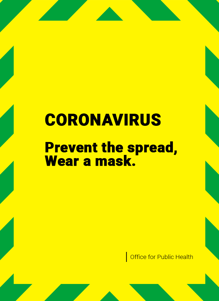
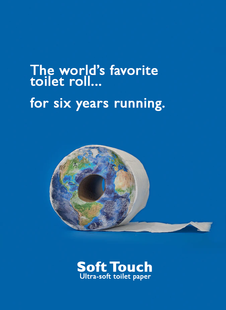
All of the advertisements across the station were created by me for this project. I utilised a lot of creative-commons stock photos from Unsplash, and in many of the ads are subtle references to all sorts of things, and some are inside jokes with friends. I had a lot of fun with these and I think it just carries the visuals that little bit further. Naming the other stations was also pretty fun.
In closing
I think I'll leave it there for now. There are certainly other bits I'd like to cover so I expect I'll end up coming back to this in the future, especially once I hear what the judges have to say about the map. So let's call this Part One!
Thank you for reading this far! I hope you enjoyed Oyster, and that you found these words interesting in some capacity. If you have any questions, do leave a comment below or email me.
Subscribe to Oyster on the Steam Workshop.
Visit the official lore website and see the cinematic trailer here.